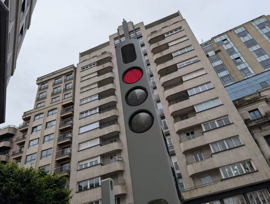
In April, I visited the Spanish city of Vigo while on a cruise from Southampton. It's a beautiful city, surrounded by dramatic scenery, with fantastic views and plenty of interesting architecture. But six months later, the thing I remember most vividly isn't the scenery or the buildings. It's the traffic lights.
It's at this point that I should probably confess that I have a photo album on my phone dedicated entirely to interesting traffic lights I've encountered on my travels.
I blame Berlin.
On my first visit to the German capital in 2018, I discovered the Ampelmännchen - the distinctive little hat-wearing figures used on pedestrian crossing signals. The Ampelmännchen figures were much loved in East Germany and became the subject of a campaign to preserve them following German reunification.
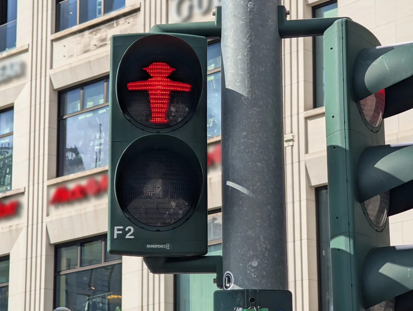
Until then, traffic lights weren't something I'd given much thought to. But there was something fascinating about seeing such a familiar piece of everyday infrastructure given its own unique identity.
That trip sparked an interest which has stayed with me ever since. Now, whenever I'm somewhere new, I find myself looking out for unusual traffic lights and pedestrian crossings. Hence the ever-growing photo album on my phone.
More broadly, I've long found public infrastructure fascinating. Road signs, traffic lights, wayfinding signage - the everyday things we rely on to navigate the world around us. They're so familiar that most of us barely give them a second thought, yet a huge amount of consideration goes into how they're designed.
With my background in digital product design, I also enjoy trying to understand the thinking behind these decisions. What problem was the designer trying to solve? What assumptions did they make about how people behave? And could something we've used in largely the same way for decades benefit from being reconsidered?
That's what makes Vigo's traffic lights so interesting to me. They managed to incorporate several features I hadn't encountered before, and they've had me thinking ever since about how we design everyday products and services around changing habits and behaviours.
So, what makes these traffic lights interesting enough to warrant an entire article?
Pavement LED light strips
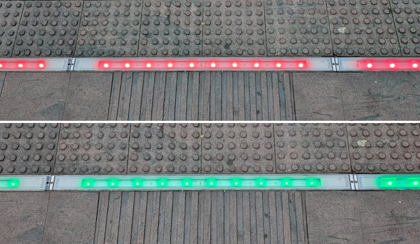
Perhaps the most immediately noticeable difference from a conventional pedestrian crossing is the inclusion of LED light strips embedded in the pavement near the crossing points. The pavement lighting isn't part of the traffic light design itself, but was introduced as part of wider streetscape improvements. Together, though, they make for a pretty futuristic crossing experience.
These strips mirror the pedestrian signals, providing an additional visual indication of whether it's safe to cross.
It's a relatively simple idea, but one that feels particularly relevant to how people behave today.
Think about how often you see somebody waiting at a crossing while looking down at their phone. They might miss the lights changing to green and end up waiting through another cycle. Worse still, somebody distracted by their phone could step into the road without properly checking the signal.
By introducing a second visual indicator at ground level, the design brings information closer to where someone's attention and eyeline might already be.
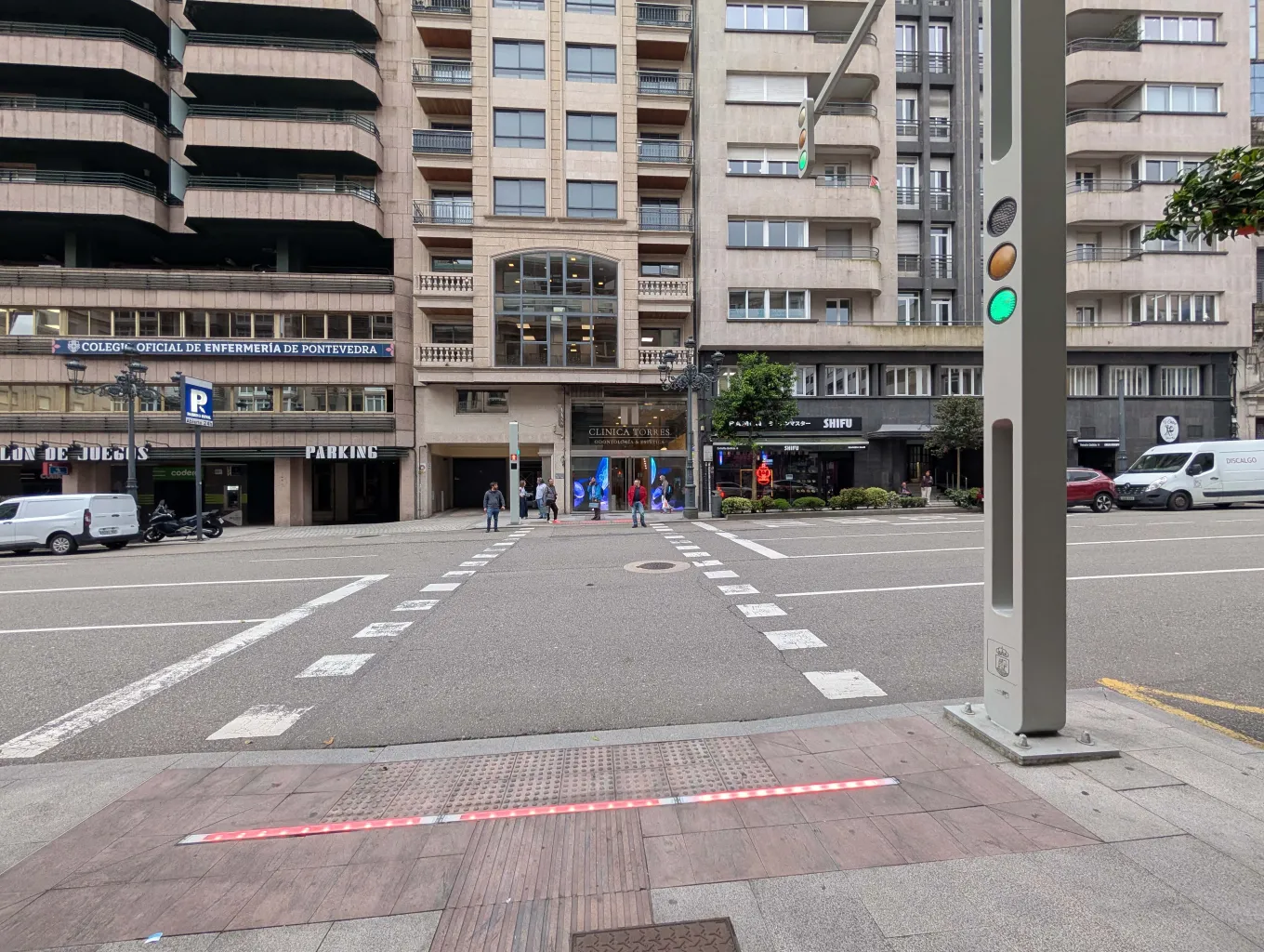
Interestingly, the illuminated pavement strips were introduced as part of Vigo's street improvements back in 2015. I don't know whether distracted smartphone users were a consideration at the time, but the idea feels particularly relevant today.
Of course, pavement lighting shouldn't replace looking up and checking the road before crossing. But as a supplementary signal, it strikes me as a thoughtful addition.
It seems like such an obvious idea once you've seen it in action, yet it's something I'd never personally encountered before visiting Vigo.
Countdown clock on green
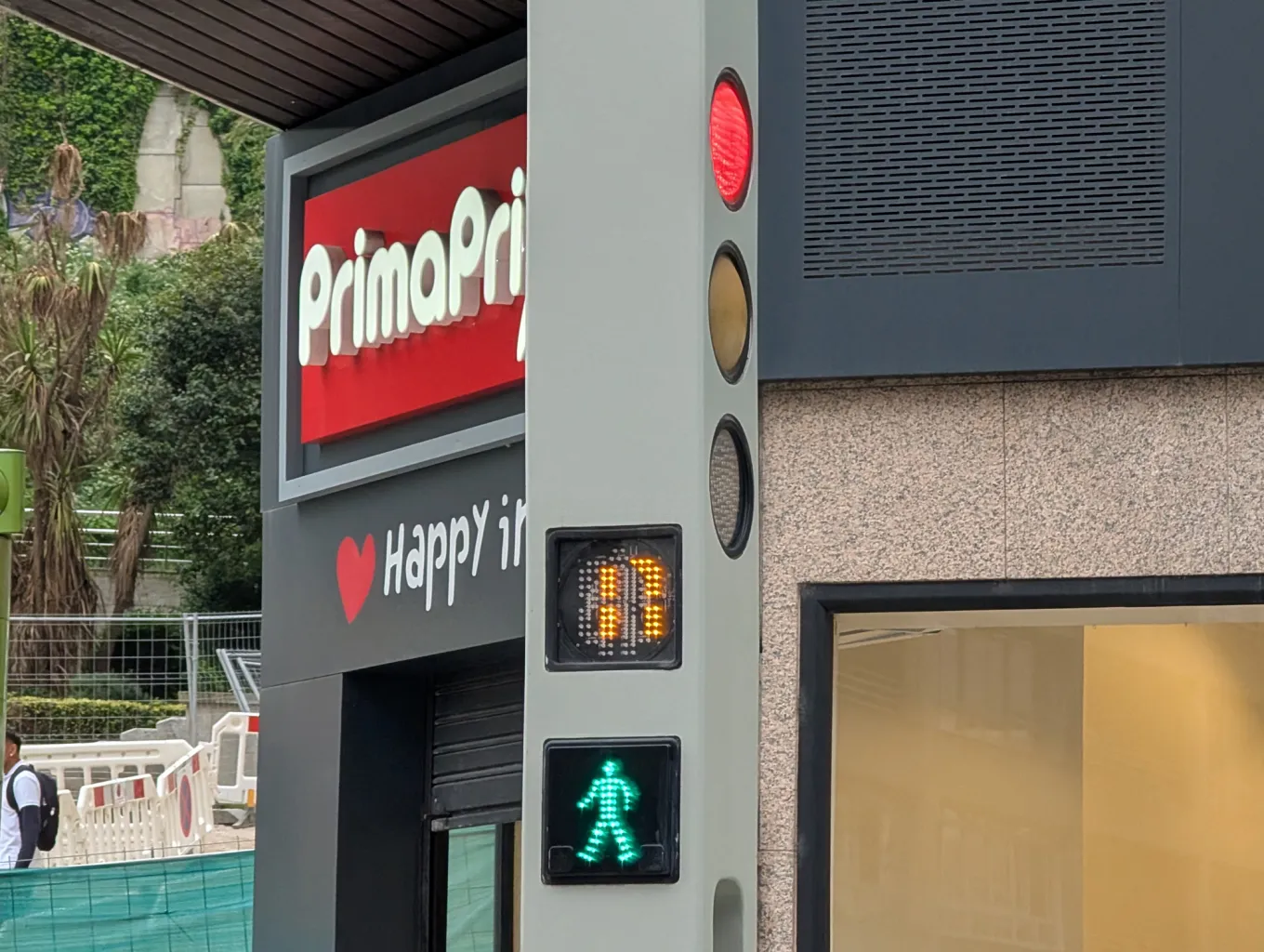
Another feature I noticed was a countdown clock accompanying the green pedestrian signal.
Countdowns aren't unique to Vigo, and I generally think they're a useful addition to pedestrian crossings. Giving people an indication of time helps remove uncertainty from the experience.
However, what interests me is when that information is displayed.
In Vigo, the countdowns I encountered showed the time remaining while the pedestrian signal was green. That's slightly different from the countdowns I've seen in London, which typically appear after the green man disappears, showing how much time pedestrians have left to complete their crossing before the red signal appears.
I can understand the thinking here. If somebody has already started crossing, knowing how much time remains could help them judge (and potentially alter) their speed and avoid being caught off guard when the signal changes.
But I wonder whether there's a trade-off.
If somebody approaches a crossing and sees that only five seconds of green remain, might they be more inclined to rush across rather than wait? Would showing how long remains until the next green signal (when the light is on red) encourage a different behaviour?
In the summer I also encountered countdown indicators in France that use an hourglass-style animation during the red phase. Although slightly more abstract, these communicate that the wait is progressing and won't last forever.
From a product design perspective, I find this fascinating. Both approaches provide information, but they potentially influence behaviour in quite different ways.
Is it more useful to know how much time you have left to cross, or how long you have to wait before you can cross?
Perhaps the ideal solution offers both, with clear consideration for pedestrian safety and accessibility.
Interestingly, there wasn't complete consistency between the signals I encountered in Vigo. Only a handful featured countdown clocks alongside combined red and green pedestrian indicators. Most used separate signal fittings without a countdown.
I wonder whether this reflects different generations of installations or simply different requirements at individual crossings?
Dual overhead and side signals for drivers
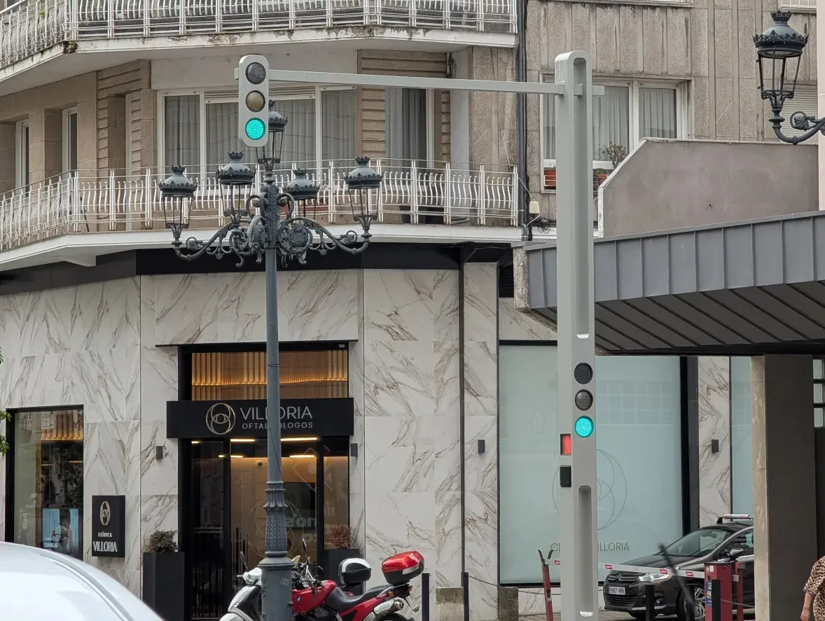
This isn't particularly unusual, but I appreciated the use of traffic signals positioned both overhead and at the side of the road.
It's a sensible approach that accommodates different viewing positions.
An overhead signal can provide a clearer line of sight from further away, particularly where other vehicles might obscure a conventional roadside signal. Meanwhile, the familiar signal at the side of the road remains available to drivers who instinctively look towards that position.
There's something reassuring about a design that provides the same important information in multiple places.
It's a useful reminder that good design doesn't always involve introducing something completely new. Sometimes it's about reinforcing existing conventions so that information is easier to find and understand.
Gaps in the poles
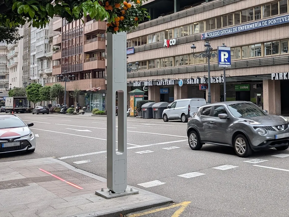
This is probably my favourite little detail, partly because it's so easy to overlook.
At pedestrian height, some of the traffic light poles feature a gap where a single structure effectively splits into two narrow vertical sections.
It's an unusual design choice, and one I don't remember seeing elsewhere.
Visually, it helps make the poles feel less bulky. But I also wonder whether it provides an additional practical benefit.
A conventional traffic light pole creates a solid visual obstruction. By introducing an opening through the structure, Vigo's design potentially allows a slightly wider field of view of the road behind it.
Whether this was intentional, a structural consideration, or simply an aesthetic decision, I don't know. I'd genuinely be interested to find out!
What I particularly like is that the detail makes me question something I'd previously taken for granted. Why are traffic light poles generally solid? Is that simply the most practical way to manufacture and maintain them, is cost the driving factor, or could alternative designs offer other benefits?
It's exactly the sort of small design decision that fascinates me.
Signals without visors
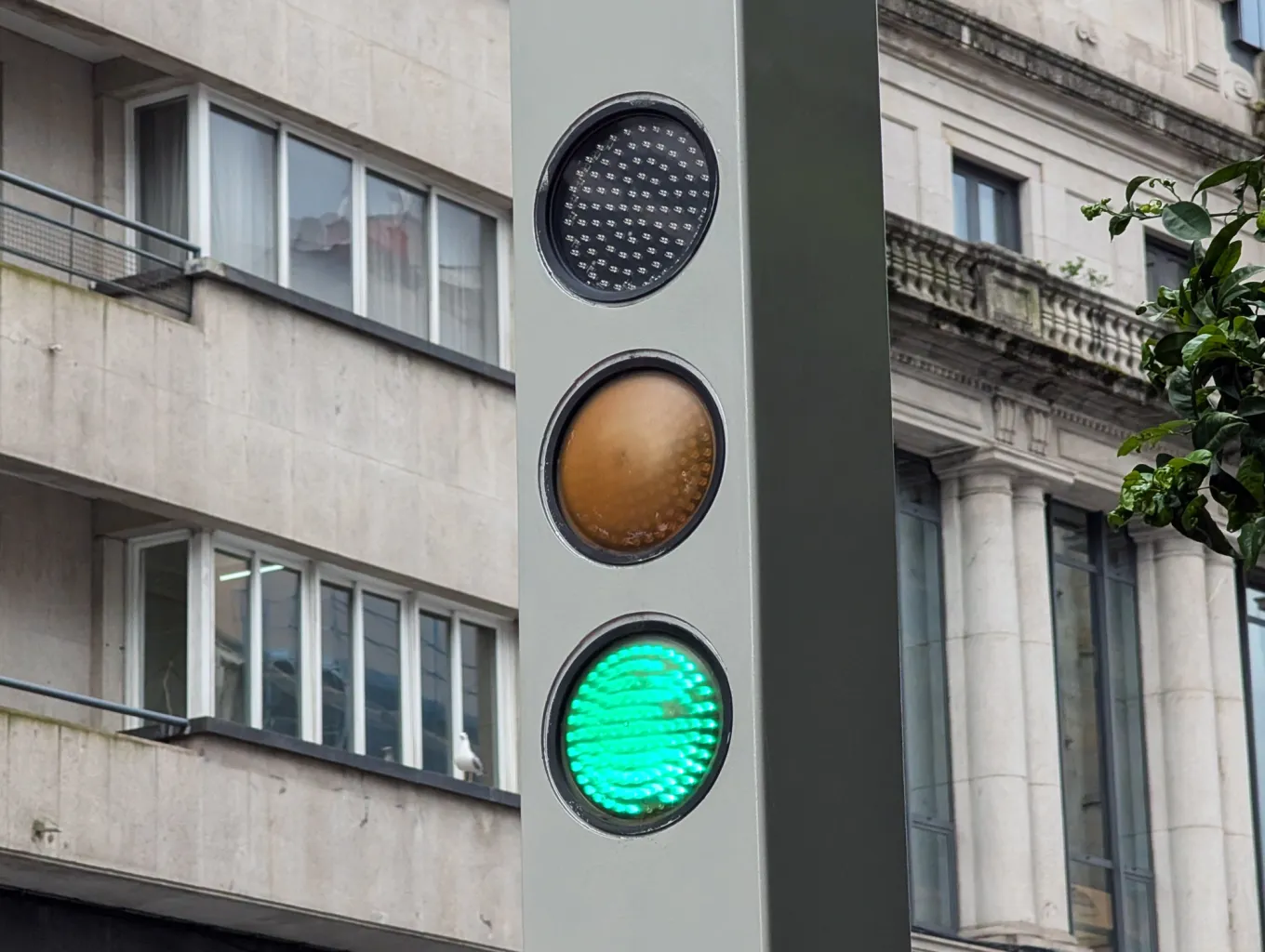
This one surprised me.
Most traffic lights I see in everyday life have small visors projecting over the individual lamps. These help shield the signals from sunlight and improve their visibility.
But Vigo's traffic lights have a much flatter, more integrated appearance, without the prominent visors I'd normally expect to see.
Surely in a city that experiences plenty of bright Spanish sunshine, protecting the signals from direct sunlight would be important?
Yet, during my visit, I had no difficulty making out the lights, even from a distance.
Looking more closely, the signals appeared to use arrays of LEDs positioned behind protective lenses. Nothing especially unusual about that in itself, but I'd be interested to understand how the design maintains such good visibility without conventional visors.
My experience was limited to a single visit, so I can't say whether the lack of visors is always beneficial. But it's certainly an interesting departure from the conventional approach.
Visual design
Okay, I appreciate this next section is entirely subjective.
Some people might look at Vigo's traffic lights and think they're horrendous. Personally, I love them.
What appeals to me is how considered the overall design feels.
After returning home, I did some digging and discovered that the traffic lights are called the Cubic, manufactured by Galician company Edigal. They're deliberately designed with a modern, minimalist appearance, which explains some of the visual characteristics I'd found so interesting.
Most traffic lights have a deliberately modular appearance. Individual signal heads, brackets and poles are visibly separate components, allowing elements to be replaced or reconfigured as road layouts and requirements change.
There's a good practical reason for that approach, particularly when infrastructure needs to be maintained over many years.
Vigo's design, however, has a much more integrated appearance.
The signal heads and supporting structures feel like parts of a single visual system rather than separate elements assembled together. The relatively slim profile and absence of prominent visors give the whole thing a distinctive character.
I wouldn't necessarily assume the construction itself is any less modular or maintainable, but visually the difference is striking.
There's a sense that somebody has considered not just how the traffic lights function, but how they contribute to the streetscape around them.
And I really appreciate that.
Public infrastructure is something we all spend time looking at, whether we consciously notice it or not. Why shouldn't it be thoughtfully designed?
What would I do differently?
As much as I admire Vigo's traffic lights, there are a few things I'd be interested in changing or experimenting with.
Context is important here. I live in the UK, so I'm naturally most familiar with British traffic light designs and conventions. Some of my preferences may simply come from years of using a different system.
Firstly, I'd explore adding a subtle coloured surround to the vehicle signals integrated into the poles.
One of the strengths of the existing design is its clean appearance, so I wouldn't want to introduce bulky surrounds or undermine the visual simplicity. However, a little additional contrast could help emphasise the signals against their surroundings.
Secondly, I'd look at introducing greater consistency to the pedestrian signals.
The combination of red and green indicators with a countdown clock feels useful, and I'd be interested in seeing that approach applied more consistently across crossings where appropriate.
But I'd reconsider what the countdown actually communicates.
My instinct is that showing the time remaining until the next green signal could be particularly helpful for pedestrians waiting to cross. It might reduce uncertainty and discourage people from becoming impatient.
At the same time, I wouldn't want to remove useful information from pedestrians who are already crossing.
Perhaps there's an opportunity to communicate both, with the behaviour of the countdown changing depending on the signal phase.
Naturally, any changes would need proper testing. Pedestrian signals are safety-critical systems, and something that seems intuitive to me isn't necessarily the safest or most accessible solution for everyone.
That's another interesting parallel with digital product design. What initially seems like an obvious improvement can introduce unintended consequences when you start examining how different people actually use something.
A final thought
For any traffic planners, transport engineers or people working in street infrastructure who happen to read this, I apologise for any misguided assumptions I've made along the way!
Traffic light design is a world away from my day job working on television and streaming products.
But I think there's a shared challenge at the heart of both: making sure people can find, understand and act on the information they need, often in a matter of seconds.
Whether that's helping someone navigate a streaming service or safely cross a busy road, the placement, presentation and timing of information can make a real difference.
What struck me most about Vigo's traffic lights wasn't necessarily that every design decision was better than the alternatives. It was that they challenged my assumptions about what something as ordinary as a traffic light could look like and how it could work.
Back in 2018, a little hat-wearing green man in Berlin made me look at traffic lights differently. Eight years later, a set of rather futuristic signals in Vigo has got me thinking about them all over again.
And yes, they've earned themselves a place in that photo album.