
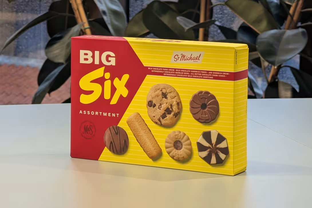
Marks & Spencer know exactly how to exploit my weakness for great product packaging. Every visit to one of their supermarkets leaves me thinking about one of their latest shelf additions. The most recent example is this fantastic 'Big Six Assortment' biscuit packaging which landed in stores at the end of September.
Brands have always leaned on nostalgia as a shortcut to trust, hoping a fond memory will tip a purchasing decision in their favour. However, at M&S, things aren't quite what they seem. This isn't just a lazy reprint of an old asset; it's a clever reimagining of the past.
In a physical retail environment filled with similar product packaging, the 'Big Six' box immediately breaks the visual pattern on the shelf. It’s unashamedly bold and bright. If you dive into the M&S digital archive, you can see the 1950s lineage. The biscuits themselves might have changed (which is a shame, as I'd have loved to try the Jaffa Eclair from the original line-up), but the packaging feels just as capable of grabbing attention in 2026 as it did back then.
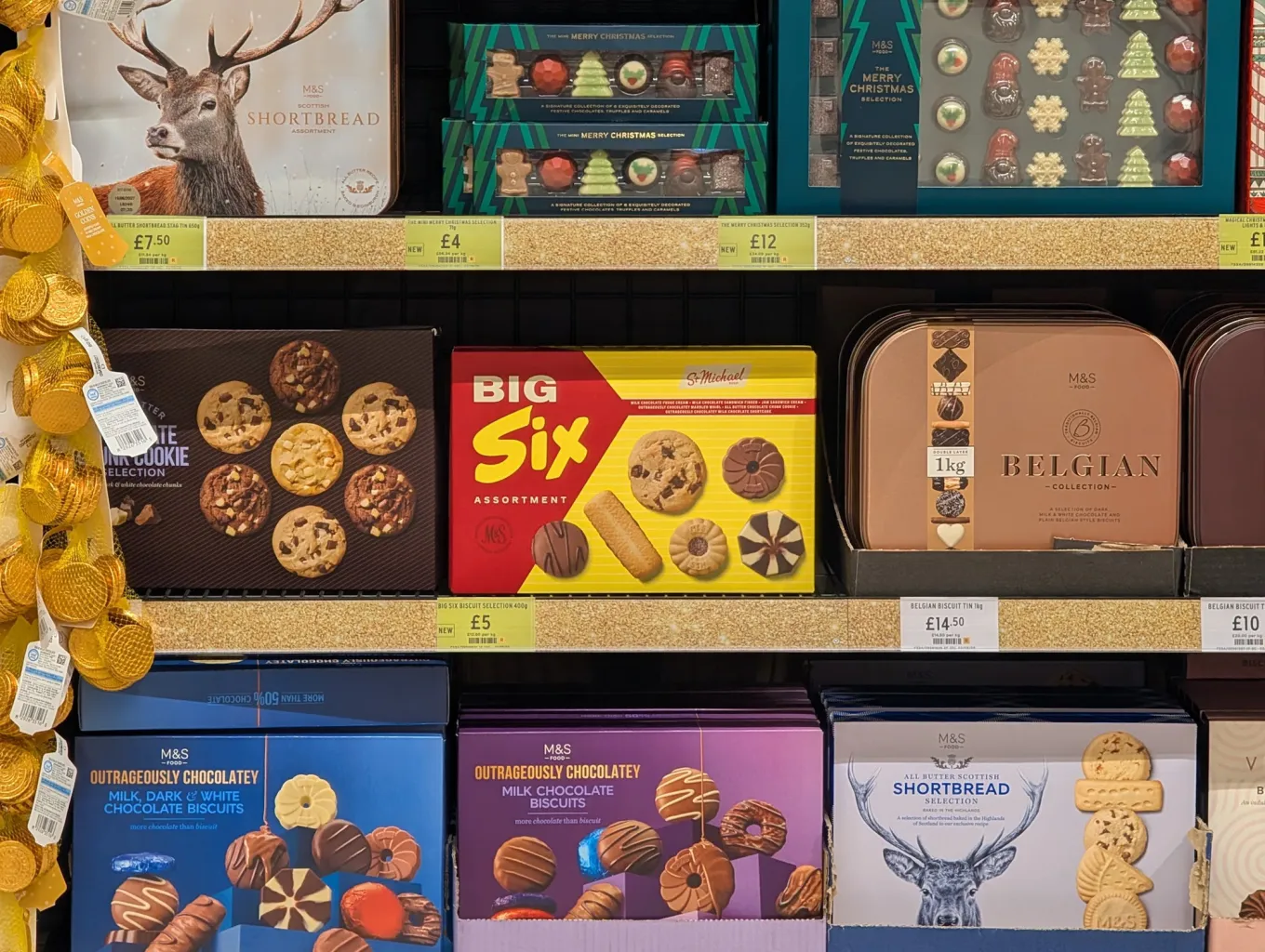
The return of the 'St. Michael' moniker is where the real product genius lies. Dating back to 1928, Simon Marks introduced the name in honour of his father, Michael Marks. It remained a hallmark M&S brand until a company-wide shift in 2000. By bringing it back, M&S has found a clever way to appeal to two very different generations of shoppers with the same packaging.
For those old enough, seeing the logo can instantly trigger brand loyalty. For younger shoppers, it bypasses traditional supermarket branding entirely, landing instead as a trendy, visually striking retro mark. Sitting right on the cusp myself, I recall lingering 'St. Michael' signage sticking around in-store into the mid-2000s, though I couldn't associate it with specific products back then.
These biscuits are part of a wider push from M&S into 'Heritage Products', which now includes retro chocolate bars and cakes. As a side-note, their 'Take 4' chocolate bar is now up there with Norway's Kvikk Lunsj as one of my favourite four-fingered chocolate bars!
Personally, I think it's a brilliant piece of physical product strategy. M&S has embraced a bolder, brasher, and louder look for their own-brand labels, showing how sometimes the best way to cut through a cluttered, modern marketplace is to confidently remix the past.
Plus, if the rest of the British public is anything like me, you'll be actively looking for an excuse to buy a box just to show it off to colleagues!